 As the Tata Group took over the nation’s most iconic airline, we all expected fresh changes. Now, on the journey to a new beginning, the group is actively making noticeable changes, starting with their iconic logo.
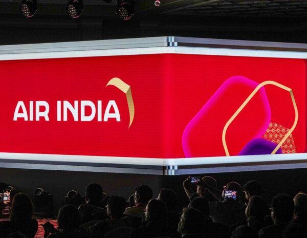
The Tata Group has named this phase Vihaan.AI, and a few days ago, they unveiled the new symbol of excellence. The new logo, called ‘The Vista,’ features a palette of deep red, aubergine, and gold highlights. The group claims that the new logo will encapsulate the bold and youthful spirit of India.
Amidst rebranding, an official mentioned that the new Air India logo draws inspiration from the winds passengers have felt on their flights from day one, symbolizing the airline’s ongoing journey. The logo was crafted by IPG’s Futurebrand, with creative films by McCann Worldgroup.
Thus, Air India now joins the list of companies that have faced backlash for their new logo. Twitter lost its iconic logo, and now the ‘X’ probably marks the birdie’s demise. Even Pepsi’s minor logo change and Pizza Hut’s new logo faced similar receptions.
Air India also adopted a minimalistic approach, like most brands, but it deviates from its iconic status. A brand built on nostalgia, symbolizing the iconic experience, has now altered its logo. The question arises: is this change for the better?
Change is usually positive, but eliminating an iconic logo often leads to social media backlash. Some are upset because the new logo discards the essence of perfection, while others find fault with the new logo’s simplicity.
The lingering question is whether the new logo can capture the essence of the nation or if it will leave a negative impression among the public.