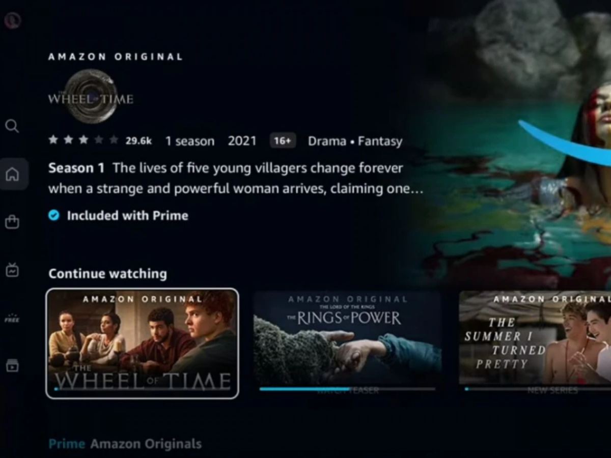
In an OTT platform we click on the “Continue Watching” section, because we are already invested in a movie or series, but if that section is buried under the fifth row, then this is a slightly frustrating thing.
This shift in interface is made by Prime Video where they added the Continue Watching section on the fifth row, and added all the rented movies or newly added movie and series on top, so users are now frustrated because they have to find the “Continue Watching” section, instead of having it as a first option when they open the platform.
This is leaving users to scroll unnecessarily just to resume what they were watching.
This move might be a minor glitch but this has left subscribers utterly disappointed.
For an OTT platform, the new layout prioritizes promotional content and monetized banners, making it clear where the platform’s current focus lies.
Many users suspect that this is another trick for monetization.
But while this may serve Prime Video’s commercial interests in the short run, it compromises user satisfaction.
A seamless viewing experience has always been one of the strongest selling points of streaming platforms, by not fulfilling that criteria Prime Video is making a big time mistake.
@PrimeVideoIN @PrimeVideo Wow, the ‘Continue Watching’ section buried in the fifth row? Genius move. Who needs quick access to what they were just watching? Must’ve been some stellar leadership that approved this. #PrimeVideo pic.twitter.com/QgV9uhSFPL
— Manas (@Princemanas99) July 22, 2025